Paper Crafting Place
Showing posts with label Copic Tutorials. Show all posts

Tuesday, March 15, 2011

TGF Newsletter Tutorial - Charms!

I had so much fun making magnets with Kim’s Magnetize It tutorial at Club Anya & Friends, I wanted to try to make some other fun stuff using the same idea! I decided to use Tim Holtz round/oval “Fragments” to make some fun TGF charms.
1. Stamp out the images you want to use. In this case I used the fabulous Miss Anya’s, some TGF sentiments and random accessory stamps.

2. Trace the outline of the fragment pieces you want to use around your stamped image

3. Color in the area inside of the pencil line, extending slightly beyond it just in case


4. If you use dark colors such as black or blue, Glossy Accents (GA) will make the color run, so use a piece of clear packing tape to cover your image, I did this with the black haired Anya.  It take the GA longer to dry and it can slip and slide if you jostle it, but it will keep your colors looking good!
5. Cover your image in a good coating of GA, better too much than too little

6. Place your Fragment pieces over your GA, you can wipe off any excess around the outside with a cotton swab/Q-tip
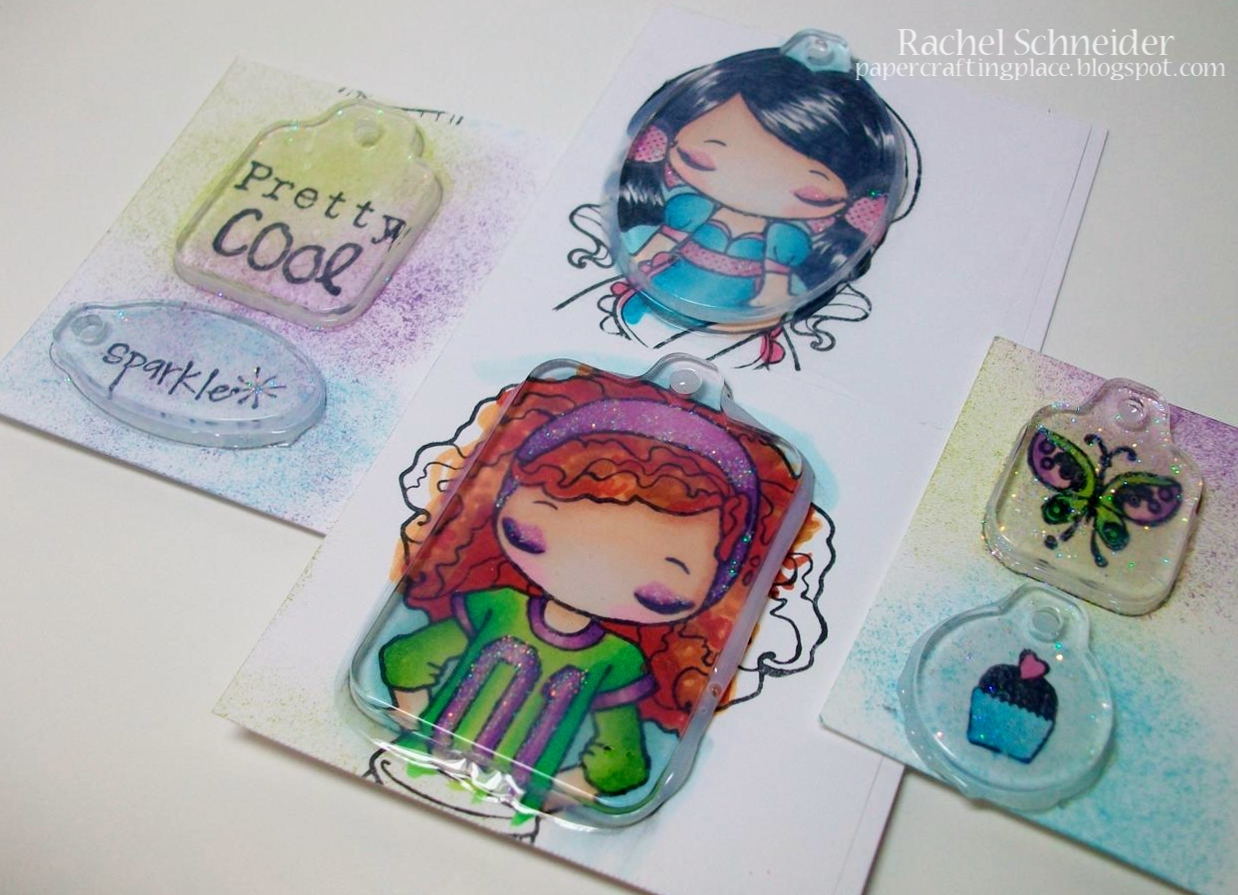

 
7. I usually wait until the GA are dry before cutting the image out, but if you’d rather cut the image out when it’s wet, either way works


8. Once the GA dries then you can attach your charm to a jump ring and put it on a necklace or keychain!


 TIP: If you want the back of the charm to be more polished or smooth, add a thin layer of GA and let it dry.


Friday, August 6, 2010

Copic Tutorial - "Changing" Colors


So I have this beautiful image and these beautiful papers that I want to use with it. The problem? I don't have the correct color tones to match the paper! So this is a quick tutorial on what I do when I need to "dirty" something up/tone it down, whatever you want to call it ;0)

I color the image first with colors that match the papers as close as I can. 


The colors on the paper are pretty, but a bit muted so I am going to add a marker with a grey tone in it, in this case YG93.  You do NOT have to use this specific marker, most markers with grey tones will work, this is just the one I personally prefer.


 I don't want to touch the pink or the olive green colors because they are fine as they are, but I do want to tone down the blues and oranges and the brighter green.  I use my YG93 to start in the darker areas and do a single light layer up to the lighter areas.  On my orange I didn't want to mess with the light orange area much so I stayed away from it, but on the blue I really want to change the whole tone so I colored over the whole area.

There isn't a huge, dramatic difference, but if you look at the orange, blue and bright green they are toned down a bit and match the paper a bit better (click on pic for larger one).


I also did the same thing on the leaves of the tree on this card; the turquiose I had was just not the right shade so I swiped it with my YG93 to tone down the color a bit:


Images by Pink Cat Studio

Wednesday, July 14, 2010

Oliver card + Copic Tutorial and CMC Challenge!!!

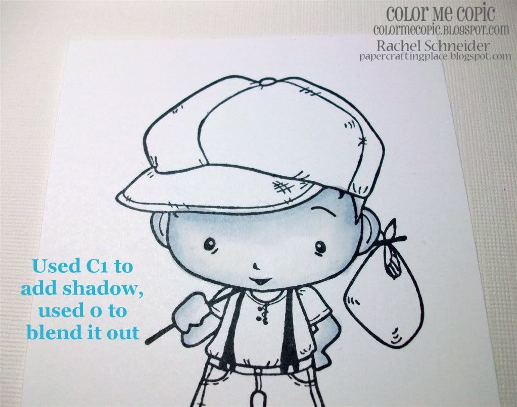
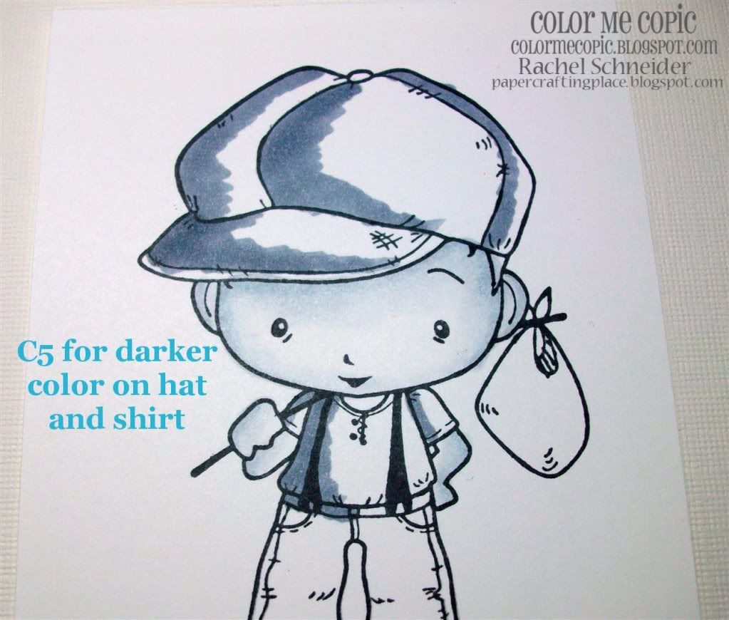
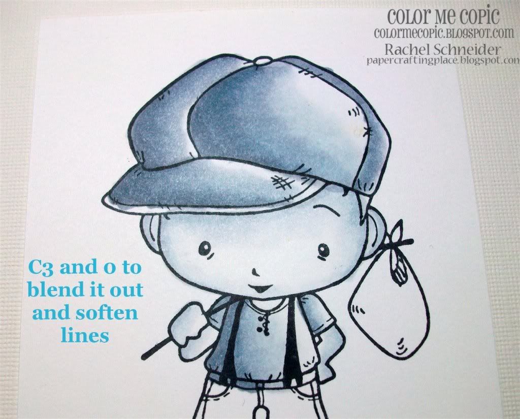
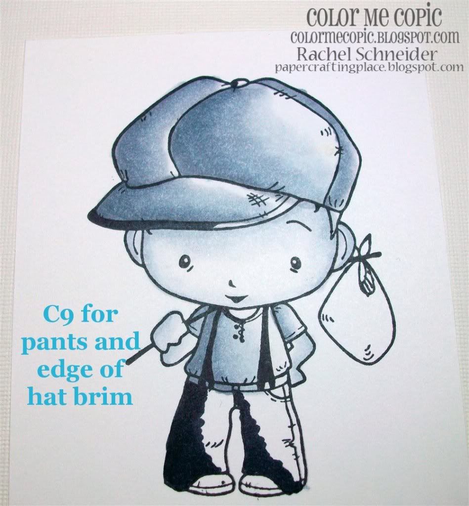
This new Oliver and Amelia set by The Greeting Farm is really one of my all time favorites, I broke it out and used it the second I got it! I used Oliver to make this monochromatic black and white card because as soon as I saw him I thought of a vintage black and white photo.  It also happens to go PERFECTLY with the ATS Wednesday challenge this week, which is "monochromatic".

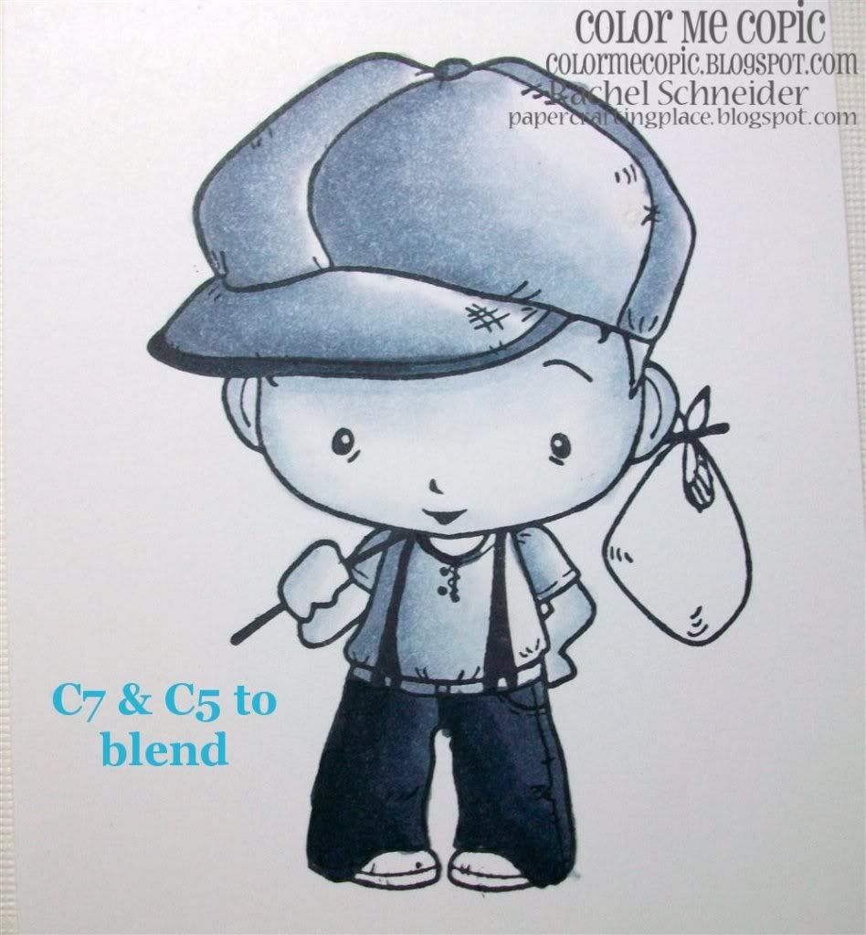
I actually made a black and white coloring tutorial for Color Me Copic too, scroll down or click HERE to see it and to take part in CMC's very first challenge which TGF has sponsored.  The winner will get this new Oliver and Amelia "Journey" set!! 

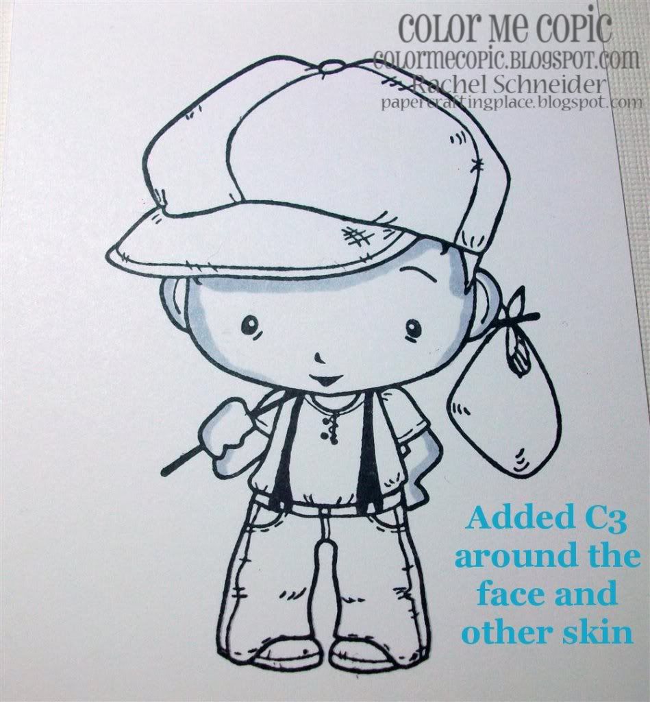
The Tutorial
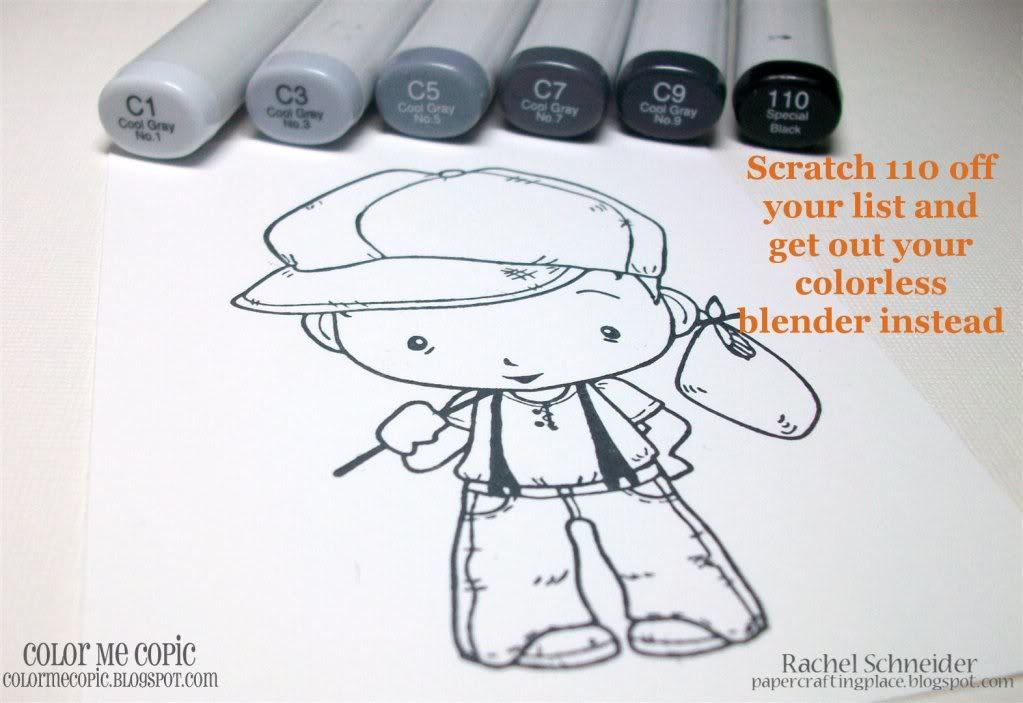
You can use any color of grays that you like, I tend to use the "C's" but neutral and warm grays will work just fine.  For this image I'm using C1, C3, C5, C7, C9 and 0 (Colorless blender).  Ignore the 110, I didn't end up using it :0)


Last step and finished image!

Used the finished image on this card so you can see how it looks :0)

Image by The Greeting Farm (Oliver and Amelia "Journey" set)

Monday, February 15, 2010

Make your stamps shine! ~*Copic Shading Tutorial*~

This is the tutorial featured in the February TGF Newsletter

There is no one thing that I do extremely well over and above everyone else, BUT I do get compliments on my coloring sometimes, so I thought I'd share how I color some of my stamps.  TGF stamps are SUPER cute and here's how I make mine shine:

First off, I use Copic markers (sketch, but it doesn't matter), Prism Simply Smooth white paper (Gina K luxury is the same thing) and stamp my images in Momento ink.  This image is "Princess Ava" from The Greeting Farm.  The paper in the background is what I'm going to use on my card so I am picking my colors to match the paper.


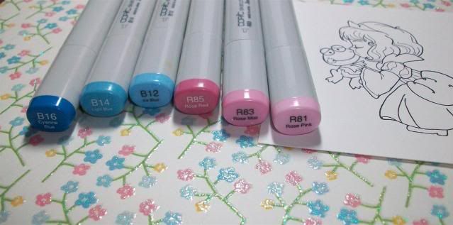
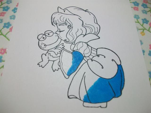
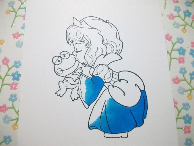
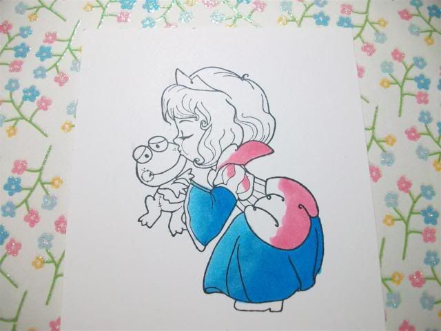
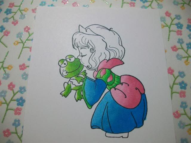
Most of the time I use 3 colors for shading.  I'm starting off with B16/14/12 and R85/83/81.  First off, I pick a light source, in this case I'm assuming the light is coming right at her face (from the left side of the page), therefore I'm starting with my darkest colors on the back part of her (or the right side of the image).  I start with B16, then move to B14 and I blend a lot where the two of them meet so hopefully there is no line.


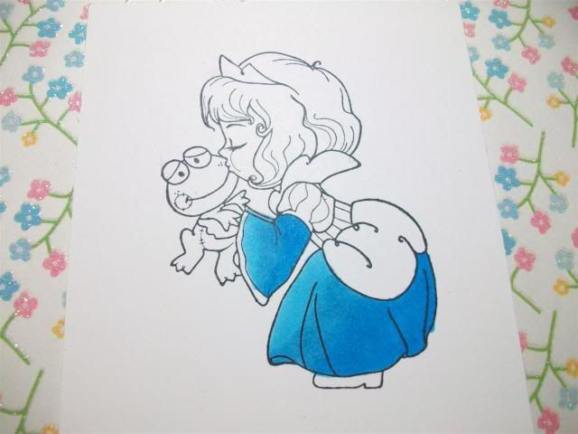
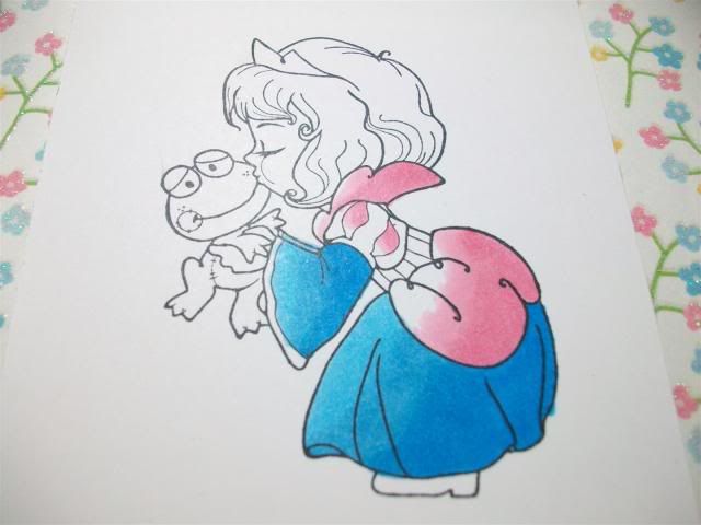
 Then I add B12, once again shading where the colors meet to avoid any lines.  I also go back and add more of my darker color, in this case B16, if I feel a bit more contrast is needed.

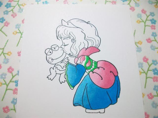
Next I do the same thing with the pinks, I start with R85... 

...then R83... 

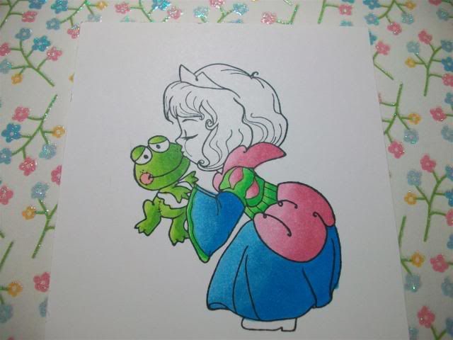
...then R81, I also added more R85 for more shadow.  I also added YG09 to her dress at this point. 
**TIP** When shading a very small area, go from your darkest (YG09) straight to your lightest (YG06), there isn't enough space to add the middle color.
 

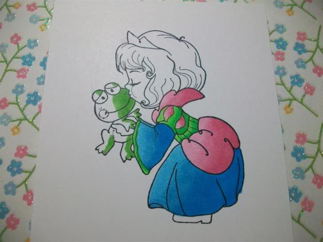
On Mr. Froggy I used YG17...
 

...then YG25...
 

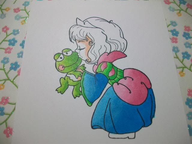
...then YG03 and R20 (for "blush" on his cheeks).
 

For her face I do the darkest color (E11) near her hairline and then move to...
 

...E00...
 

...then E000 with R20 for accents on her cheeks and eyelid.
 

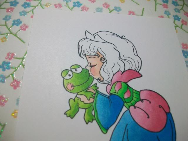
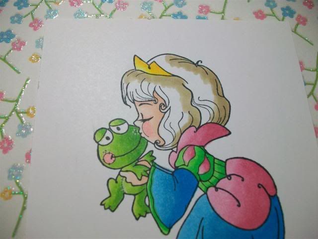
Her crown is Y17,Y08 and Y13.  I started shading her hair with Y28.
 

Then I finished her hair off with YR21 and Y21.
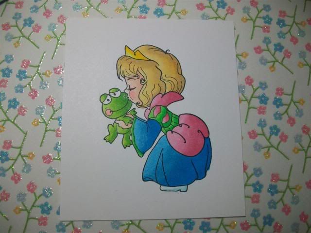
And here she is!


These are just my tips, some people go lightest to darkest, some go over the whole area before shading, etc.  There is no wrong way!

My "method":
1.  Try to use 3 colors for blending, within 3 digits of one another if possible.
2.  Darkest to lightest, blend blend blend where they overlap!
3.  When shading very small areas, skip the middle color and just go darkest to lightest.